North London Hospice
3D animation, Concept Design, Art Direction, SPFX | Equalities Strategy Explainer
We created a 2 minute long animation that will be used to launch North London Hospice’s new organisation strategy promoting their core values and new strategic approach to developing the organisation as they support patients and their families with end of life care.
The project brief was to create an engaging and enjoyable animation that would be watched by colleagues and the public alike. It should be a powerful but subtle ‘on-boarding’ tool for the organisation and it should be adaptable to a variety of public audiences, through a series of marketing cut downs edited specifically for social media, aimed at promoting the hospice and its services, volunteering opportunities and community activities.
Ultimately the animation’s purpose was to share a new, unifying vision for the work of the hospice, creating clarity, cohesion and transparency of purpose for the community that the works with the them.
North London Hospice’s core values were key to the design focus, as was their presence and inclusion of the local communities of Barnet, Enfield and Haringey that it has served since 1984. These values include: collaborative, supportive, accessible, transparent, mindful, respectful, empowering, kind, inclusive, fair, welcoming, ambitious, innovative and sustainable.
We took the approach of analysing the work that the hospice does through the prism of their overarching mission: to provide the best of life at the end of life. With staff at the hospice we explored what constituted the best of life, what occasions, actions, conditions and states might best exemplify great moments in life, such as time with family, cooking a meal, tending a garden, going on holiday, staying fit and active through exercise, meditation, dancing and creativity. We then looked at contexts that best represented the physical spaces and presences of the hospice and its brand throughout its communities, how it might be recognised and how end of life care is delivered.
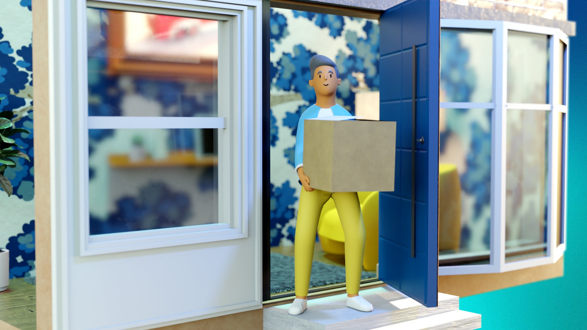
Styling combined soft edged and round formed animated characters in bright clothing and representing the multicultural community that make up the hospice staff and patients with high detail, photoreal environments finished with a bright neon rainbow palette and lighting.
Environments were placed within individual letters of the organisation’s brand name, this included the hospice building and gardens, the hospice’s charity shops, their annual fun walk event, their offices and call centres, patient rooms and representations of patients receiving at-home care.
It was key that the design represented the dynamic nature of the hospice’s work, the light and joy that the organisation brings to some of the most challenging moments of life and their ambitions for the future, to grow and continue to deliver outstanding care when their patients need it most.
"Suum.studio really got to the heart of what we do and why, they created something that was incredibly unique to us with an impressive attention to detail.
As a product the animation excelled in delivering exactly what we were looking for, we are very proud of it and how it showcases our organisation."
- Paul Jordan, Head of Communications and Marketing, North London Hospice
Animation and marketing edits

Full animation

60 second social media edit

30 second social media edit

15 second social media edit
Stills